
Introduction
Google’s mobile-first indexing started back in 2016 but it came out as a full-fledged update in 2018. All of Google’s indexing is now mobile first.
Understanding the mobile-first index
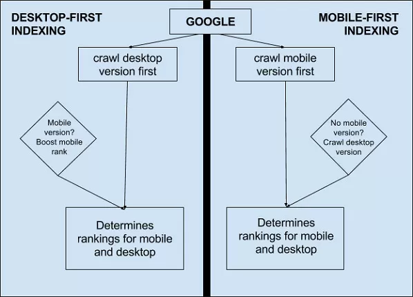
Mobile-first index, as the name implies, means that when Google indexes the pages of your site, it puts the mobile version of your site over the desktop version. While desktop version still gets indexed, if your site isn’t optimised for mobile, then it may experience a negative impact in rankings.
However, it is crucial to understand the difference in the way mobile and desktop versions are created. You can either keep the same URL for both sets of users or have different URLs. When you have different URLs for both, you need to follow certain practices to have your site optimized.
Best practices for mobile-first:
Metadata should be present on both desktop and mobile versions
A crucial part of search engine optimization is concerned with your site’s metadata. When you are optimizing your content for the search engines, it is important that you focus on the meta titles and descriptions and ensures that they are equivalent for both mobile and desktop sites.
Additionally, make sure to assign optimized ALT attributes to your images and not leave them blank.
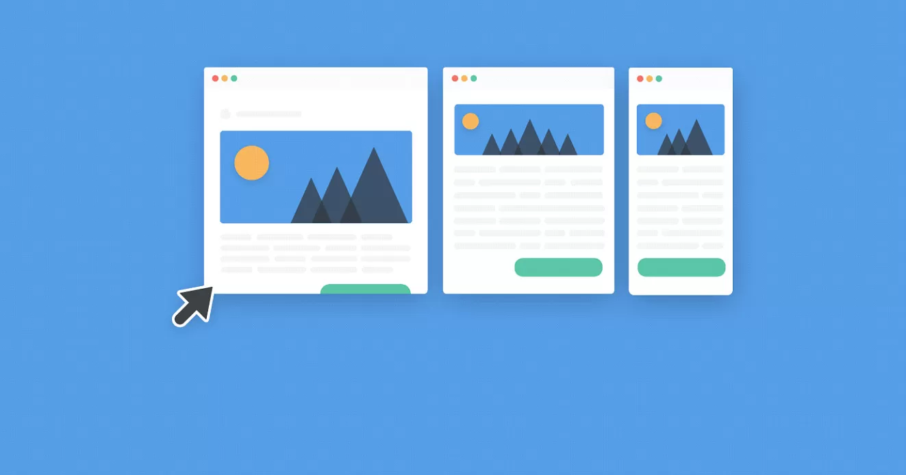
Same content on mobile and desktop sites
When you have separate URLs for your mobile and desktop sites, it is common to have less content on the mobile version as compared to the desktop version. To ensure that mobile-first indexing helps your site, keep the same content on your mobile pages as you have on your desktop pages.
Use responsive design
Responsiveness is a critical measure of mobile-friendliness. If your site has a responsive design, it offers an enhanced experience. By a responsive site, we mean that your site is responsive to a change in the device and adjusts accordingly, meaning that the readability on both mobile and desktop is maintained.
Bring down your site load time
When it comes to mobile optimization, site speed matters a lot. In fact, if your website takes more than 3 seconds to load, it could mean you lose almost half your site visitors.
So if your site takes longer to load, focus on bringing down the load time. To achieve it, you should first look at the visual content on your site and reduce the size of the files, if necessary. Run a website audit to identify what’s causing high loading times and fix the problem. Remember to think mobile-first when optimizing site speed.
Closing thoughts
With mobile internet usage surpassing desktops, it was clear that Google needed to take a step in that direction to make the experience better for its audience. That’s when the search changed and mobile-first indexing took shape. With its advent, it’s clear that if you aren’t mobile-ready yet, you might be missing out on a good chunk of traffic.
FAQs
What Does Mobile-First Indexing Mean?
Mobile-first indexing is an approach used by Google where it uses the mobile version of a page for indexing and ranking. While the desktop version of the page still gets indexed, Google prioritizes the mobile version of the page over the desktop version.
If your site is not optimized for mobile, then the site may experience a negative impact on its ranking. Since mobile devices are responsible for a majority of web traffic, Google has started using mobile-first indexing as one of the major ranking factors.
How To Do Mobile First Indexing?
You need to follow the mobile-first best practices mentioned below:
- Keep metadata in both desktop and mobile versions.
- Make sure Googlebot can access and render your page content.
- Ensure the data on your site is structured.
- Use the same content on both mobile and desktop sites.
- Make your website design responsive.
- Bring down the site’s loading time to 3 seconds or less.
- Check the placements of ads on your site.
- Check the visual content on your site.
Why Is Mobile First Indexing Important?
Mobile-first indexing allows you to reach your audience faster. It helps you get a better ranking on Google, which leads to a higher reach. As mobile-first indexing helps your content be seen by more people, it also boosts your chances of converting visitors into customers.