
Introduction
Despite how it ended for Jumpshot, there is no denying that the Avast subsidiary was great at collecting data and has provided marketers and businesses with invaluable and surprising insights.
One such insight was about Google image search. According to a 2018 report by Jumpshot, over 20% of all US web searches take place on Google Images. With the introduction of the ability to search the web using images, the already crucial importance of images in SEO is going to become even more important.
In other words, SEO success in 2021 is going to be extremely difficult to achieve without optimizing images.
Visual Content And SEO: A Match Made In Search Engine Heaven
It has been some time since the marketing world realised that Google places more value in web pages that contain visual content. It also places websites containing visual content like images higher in its search results (than text-only websites).
Despite knowing that for several years, there is a serious dearth of actionable advice on how to optimise images for search engines.
If you too, are tired of reading about optimising alt tags as the only advice for image SEO, this guide is for you.
There’s much more that you can do to make your images more search engine friendly. In this guide, we will talk about it all. Without further delay, let us begin.
Name Images Appropriately
As you may already be aware, algorithms don’t have eyes to “see” images and process what they are. Instead, algorithms use a set of signals to understand what they are looking at, and Google’s algorithms are no different.
One such signal is the file name of the images you upload to your website. Here’s Google’s advice on naming images:
“the filename can give Google clues about the subject matter of the image. For example, my-new-black-kitten.jpg is better than IMG00023.JPG.”
That’s sound and complete advice that you can start applying right away.
However, with the kind of advancements we are seeing in the machine learning and artificial intelligence fields, is naming images properly even necessary?
The answer is, yes.
While Google may be able to understand a lot of images accurately without any help from webmasters, their algorithm is still learning and has a long way to go and a lot of images to see. It may not mistake your image of a black kitten for an image of a kettle, but it can still make mistakes like mistaking butter for cheese.
This means, properly naming your images, with descriptive text, is still important from an image SEO point of view. Changing image file names will not take a lot of time or effort and can potentially help you secure some easy SEO wins, especially in relevance to image search.
Don’t Ignore The Alt Text
I know I wrote some mean things about this advice, but that doesn’t mean that optimising the alt text of your images is not important. The alt text of your images is important for the following reasons:
Descriptive alt text makes your website content more inclusive. It makes your image content accessible for the visually challenged users that utilise screen readers.
Alt text also makes it possible for the users using low bandwidth internet connections to understand the images on your web pages. Often, images make up for the biggest chunk of data on web pages and low bandwidth connections are not able to load them properly. However, such connections can load the alt text relatively quickly and make your images accessible to everyone.
Search engine crawlers, including those of Google’s, use “alt text along with computer vision algorithms and the contents of the page” to understand the images on a page. This information was pulled straight from a Google Help page.
Finally, if you plan on placing links on your images, your alt text can act as an anchor.
So, how does one go about optimising their alt tags? Follow these tips:
Make them descriptive
As mentioned before, the most pressing use of alt tags is to make the images understandable for visually challenged users and users with low bandwidth connections. Fulfilling this need will mean that you are creating a more friendly user experience on your website. Descriptive alt tags will also enable Google’s website crawlers to understand your images with more ease and accuracy.
Optimize with keywords
Alt tags are an excellent place to add keywords, especially if you are placing links on your images. With that said, it is important to ensure that the keywords you are using are contextually relevant to the image.
Don’t stuff keywords
Just like keyword stuffing is bad when done with text-only content, it is also bad in the case of alt tags and in Google’s words, “may cause your website to be seen as spam”.
Add Schema Markup
Adding schema markup to web pages is a common SEO best practice. It allows search engines to display rich information about your pages in their search results. This rich information, in turn, helps users find the information they are looking for with more efficiency and enables the search engines to send more targeted traffic to different websites. Here’s what a search result optimised with schema markup looks like:
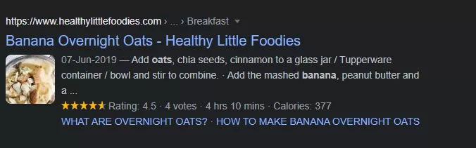
Just like schema markup improves the quality of regular search results, it can improve the quality of image results as well, especially for users using mobile devices. This is true because Google now displays relevant information badges along with image search results. This is what they look like:
As of today, Google supports four types of schema markup badges- recipes, videos, products, and GIFs.
You can add the relevant markup to your website images. Website owners don’t have to add any schema markup for their GIFs and Google has the capability of detecting those automatically.
If you don’t feature any content that is relevant to the available badges, you don’t have to bother with them. If, however, you do have such content on your website, definitely don’t overlook them.
The fact that Google has introduced these badges for only the four types of content suggests that it may be because Google realised that users searching for information related to these badges often use Google Images to start their search.
Pay Attention To The Image Format
Your website’s performance has direct influence over its SEO performance. The page load time is crucial for SEO and Google has also confirmed that it is a ranking factor.
With the recent introduction of Core Web Vitals, the performance of your website will play an even more crucial role in deciding its position in the search engine result pages (SERPs).
Why am I mentioning this here? Because the images on most web pages are usually the biggest chunk of data and most responsible for causing delays in load times.
Moreover, different image file types offer different resolutions, and vary in terms of “weight”. Thanks to these differences, different image file types are fit to be used in different cases. Knowing when to which type of image can make a lot of difference in the performance of your website and in turn, the results of your SEO efforts.
To learn which image format you should be using, let’s begin by understanding each one in a little more detail. The following image formats are commonly used on websites across the web:
PNG
Images in PNG format are of the highest resolution, as compared to other formats on this list. However, PNG images also have the largest file size.
JPEG
JPEG images have the smallest file size of all the image formats on this list. Their resolution quality is also relatively lower than PNG images.
WebP
WebP is a new image format that has been developed for the web. Naturally, it has been developed keeping the need for speed in websites in mind. As a result, images in WebP format can be up to 3 times smaller than those in PNG format. Images in this format are relatively lower in resolution but the notice is hardly visible. Since WebP is a new format, not all browsers support this image type. However, all major players including Firefox, Chrome, Edge, and Safari now support WebP.
GIF
Graphic Interface Format or GIF is a format used for “moving images”. These are short clips that don’t have any sound, are very small in size (as compared to video) and very popular on the web, thanks to the meme culture.
Here’s a resolution comparison of these image formats:
There are a lot more technical differences in these formats but since they are not relevant to this guide, I will not be talking about them.
As you can see, the difference in resolution is barely visible in this image. However, the difference may be more apparent in the case of images that contain text.
So which format should you be using?
I like to use a mix of these formats on my websites. For regular images, I like to use JPEG or WebP. For screenshots and images that contain small text, I like to use the PNG format. For quirky short clips, GIFs are the way to go. I haven’t personally used the WebP format yet, but it is recommended by Google so I plan on starting that very soon, and I recommend you do the same.
Most image editing software and tools will ask you the format in which you want to save your images. Depending on their purpose, you can choose the right one and save yourself from the trouble of converting them to a different format.
For images that you already have, you will need a conversion tool. Fortunately, the web is filled with several tools that will get the job done for free, like this one.
Size Matters
So we have established that JPEG images take up the least amount of bandwidth on a web page. However, what if I told you that they can be further compressed? Take a look at this example:
As you can see, both images are in the JPEG format but the difference in quality is barely noticeable and the difference in file size is significant. This has been made possible thanks to something called compression. Google has even published detailed guidelines on how to compress images. Google strongly recommends using image compression and has even recommended free tools that you can use. The top tools recommended by Google are:
Keep in mind that these tools are command line tools and will require basic technical expertise to be correctly operated. If you don’t have that kind of expertise, Google recommends using ImageOptim.
Unfortunately, ImageOptim only works on Mac. However, their website recommends alternatives that are equally good and work on other operating systems. You can find them here.
With that said, there are many other great image compression tools on the market that are free and produce results that are at par with all the above Google recommended tools. Shortpixel, TinyPNG, and Compressor.io are some of my favorites.
ShortPixel even offers a WordPress plugin that will compress upto 100 images a month for free. It even has the ability to compress all the images of a WordPress site with a single click.
Define Your Dimensions And Make Sure Your Images Are Aligned
For websites that are using Accelerated Mobile Pages (AMP), it is mandatory to define image dimensions in the source code. However, the same is still recommended for websites that are not using AMP.
When you do this, you can make sure that all images on your website are aligned with your defined dimensions. If multiple people are uploading content to your website, you can ensure consistency easily. This kind of consistency makes for great user experience, and Google loves websites that deliver pleasant experiences to users.
To that end, it is also important to ensure you are adding width and height attributes for each image on your website.
Besides bringing consistency to your content, defining dimensions and image size attributes also allows you to minimise the cumulative layout shift on your website. Cumulative layout shift (CLS) is a part of the recently introduced Core Web Vitals and will not be playing a significant role in communicating the quality of user experience on your website to Google.
What is CLS?
To put it simply, CLS is the measure of layout shift that occurs on web pages that feature images. According to Google’s fresh new guidelines on Core Web Vitals, this measurement should be less than 0.1.
Defining your website’s dimensions will help you achieve satisfactory results in this respect.
Make Your Images Responsive
Responsive pages are quite well-known. These pages adjust themselves to fit the screen of the user, thus improving the user experience for mobile device users. However, responsive images, that serve the same purpose, are not as well-known.
Perhaps the reason is that when a website is responsive, the browser will display the image according to the size of the screen of the user’s device.
So, there’s no problem with using non-responsive images, right?
Wrong.
Let’s understand this problem with the help of an example. Let’s say you have an image on your website that is 720 px. Now, you are trying to open this image on a device that only supports 320 px. The browser on said device will definitely load and display the image, but it will be loading an unnecessarily large image, thus slowing down load time.
Responsive images solve this problem by allowing the user’s browser to choose the best image size according to the user’s screen.
The following code makes it happen:
image tag src="image.jpg" srcset="image-medium.jpg 1000w, image-large.jpg 2000w">
When this code is associated with an image, the browser gets to choose the image size that is most efficient to show to the user. This helps reduce the bandwidth used to display the image and in turn, the time taken to load the page.
The good news is, if your website is based on WordPress, you don’t even have to upload different image sizes to make it happen. In fact, you don’t even have to include the code manually. WordPress does it all automatically.
This is possible because whenever you upload an image to WordPress, the platform makes multiple versions of that image by default. In most cases, these versions are:
- Thumbnail: A small square crop of the image, usually 150 px by 150 px in size.
- Medium version: This version is resized such that the longest side (in length or breadth) is no more than 300 px.
- Medium large version: This version is resized to 768 px.
- Large version: This version is resized such that the longest side is 1024 px.
- Full: The original image, in its original uploaded dimensions.
If, however, you are not using a WordPress website, you will need the help of a web development expert to implement this. Alternatively, Google recommends this free course that will teach you how to develop images that “adapt and respond to different viewport sizes and usage scenarios”.
Whatever the case may be, the effort involved in serving responsive images is well worth the reward.
Create An Image Sitemap
Despite having a descriptive file name and an equally descriptive alt tag for all your images, there may be cases when some of the images on your website are not found by Google’s crawlers. The most common instances of this can be seen in websites that use a content delivery network (CDN) and those websites where the images reach with JavaScript code.
Website owners usually have two options when it comes to images and sitemaps. They can either add additional information about images to their sitemap or create a separate image sitemap for their website.
If you are using a CDN to host your images, you will have to create a separate sitemap for your images. This is because regular sitemaps enforce cross-domain restrictions. If you want to create a separate sitemap for your images, Google has published an excellent guide on the subject.
For those who don’t host their images on a CDN, adding images to their current sitemap is a good idea. If you are using WordPress, along with the Yoast plugin, then the plugin will add your images to your sitemap automatically. The only exception is for images that are accompanied with captions.
WordPress website owners that use captions with their images, and website owners that are not present on the WordPress platform will have to perform this task manually.
Use A Content Delivery Network
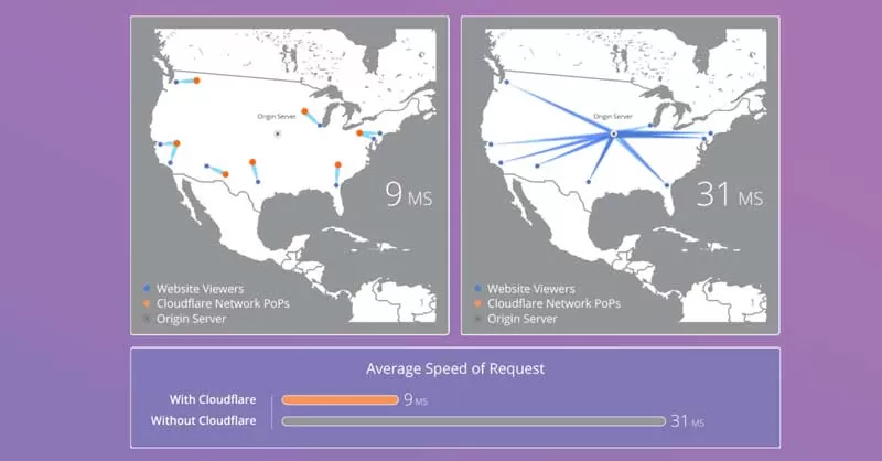
A content delivery network lightens the load on your website by hosting heavy files on a network of separate servers. It works by serving the content it hosts to the user from a server location that is closest to the user.
For instance, if your website is hosted in the United States and you use a CDN, a user opening your website in Singapore will be served content from a server (that is part of the CDN network) in Singapore.
These two factors together help reduce the load times of your website and improve the user experience. Using a CDN enables you to improve your website’s user experience by making it faster, and enabling you to make it aesthetically pleasing by using high resolution images without worrying about the performance.
Here’s a great depiction of how a CDN benefits website speed by CloudFlare, a leading CDN provider:
There are many other great CDN options available today. Besides CloudFlare, KeyCDN and Google’s Cloud CDN are excellent at what they do.
With that said, CDNs are not all rainbows and butterflies. They come with one major shortcoming. The content served through the CDN will have the URL provided by your CDN provider. That means, instead of www.yourwebsite.com, the URL will look like www.CDNproviderURL.com.
From an SEO standpoint, this is disadvantageous because if you are hosting high quality and useful images on a CDN, someone may want to embed them on their own website or even link to them. In doing so, there is a good chance that they will link to the CDN instead of your website.
However, there is a solution to this problem. You can create a CNAME record to make the CDN a part of your domain network.
Sounds confusing?
Don’t worry, refer to this guide for the step by step process to do this (and to set up your CDN).
Enable Browser Caching
Using a CDN enables you to quickly serve images and other heavy media on your website to first time visitors. Similarly, browser caching enables you to make this experience even faster for repeat visitors.
To put it simply, browser caching let’s your visitor’s browsers store the images on your website in their device’s memory. When they return to your website, the stored images are pulled from their own device memory and shown to them. This way, you save on the bandwidth of loading the images again and again and deliver your repeat visitors with a lightning fast experience.
Enabling browser caching is a simple process. WordPress users only need to install a caching plugin on their website. I recommend using W3 Total Cache. If you don’t have a WordPress website, you can paste the following code into your .htaccess file:
IfModule mod_expires.c

ExpiresActive On
# Images
ExpiresByType image/jpg "access 1 year"
ExpiresByType image/jpeg "access 1 year"
ExpiresByType image/gif "access 1 year"
ExpiresByType image/png "access 1 year"

IfModule
The “access 1 year” part of the code dictates how long your images are stored on your users’ devices. You can change this to different amounts of time like “access 1 month” or “access 1 day”.
If you don’t have enough knowledge of website coding, I recommend seeking the help of a professional to enable browser caching on your non-Wordpress website. Small mistakes can result in severe consequences when it comes to code.
Enable Lazy Loading
Enabling lazy loading is another way to host high quality (and heavy) images on your website while minimizing its influence over the load speed.
With lazy loading enabled on your website, the browser loading the website defers from loading the entire thing in one go. Instead, it loads the images as they appear on the screen. This means, if a user has the first fold of a particular page open on their screen, the browser will only load the images visible in that fold. The images present below the first fold will only be loaded when and if the user scrolls down.
Google has a great guide dedicated to implementing lazy loading in a way that it drives SEO benefits. You can read it here. That said, implementing lazy loading involves working with JavaScript. If you don’t have the kind of technical capabilities required to do that, it is best to hire a developer to get the job done properly.
WordPress website owners can also try using the A3 Lazy Load Plugin.
Whenever Possible, Use Vector Graphics
Digital images can be broadly divided into two categories- vector and scalar. Regular images are scalar graphics and use pixels. This means, they can get pixelated.
On the other hand, vector graphics are made using lines and angles, there are no pixels involved. This quality of vector graphics offers a few significant advantages. For starters, vector graphics don’t pixelate. No matter how large or small they become, the resolution of vector graphics always remains perfect. The other significant advantage associated with vector graphics is that their file size is much smaller than the pixel-based scalar graphics.
The most popular vector graphic format on the web is Scalable Vector Graphic (SVG). These are supported by all modern browsers. Such graphics are well-suited for images that are based on geometric shapes. Common examples include logos, icons, and digital illustrations.
The World Wide Web Consortium has a great guide dedicated to creating vector graphics. Graphic design applications, such as the immensely popular Adobe Illustrator are also capable of creating vector graphics.
With that said, simply creating and uploading vector graphics to your website is not enough. Google recommends that even these should be further minified and compressed with GZIP.
Svgo is Google’s recommended tool for minifying SVG files. Once again, this tool features a command line interface. If you are not comfortable using the same, this free online tool is a superb alternative.
GZIP compression is enabled at the server level of your website. To check whether it is enabled, you can use this tool. If it is disabled, you can use this guide to enable the same.
Bonus Tip: Refrain From Using Stock Images
The reason behind the popularity of stock images is not that they are amazing, it’s that they are convenient. As a result, thousands of websites look closely similar and sometimes, even the same. The sad thing is, similar looking websites, using the same stock images, are often from very different industries!
Remember that the top two reasons to use images on your website are improving the aesthetic appeal of your website and creating a positive, delightful user experience. Stock photos will hardly ever contribute to achieving any of those objectives.
It may be a little more troublesome and sometimes expensive but I strongly recommend using original photographs, graphics, and screenshots on your website. While no study has yet proven that doing so will result in better SEO performance, it will definitely help your website to stand out and help you create a positive user experience. Once Google and other search engines realise that users love the experience on your website, they are definitely going to reward you with more targeted organic traffic.
Conclusion
There you have it, actionable ways to end up higher in Google Image search results. You may have noticed that only a few of the above-mentioned tips are actually about optimizing images or image files. That’s because using images is already an SEO best practice. Image SEO is all about using images and still delivering a delightful experience on your website.
FAQs
What Is Image SEO?
Image SEO is optimizing images on a website to improve their visibility and ranking on search engine result pages. It consists of elements such as image type, size, time taken for loading, and optimization with the help of tools such as Alt text and file name. By following the best image SEO practices, you can enhance the ranking of your website on search engines.
What Image Type Is Best For SEO?
The website’s load time directly influences its ranking in SERPs. The images of a webpage are a crucial factor affecting the load time because they eat a significant chunk of your visitor’s data while loading.
Hence, the choice of image type will depend on your website’s requirements.
Widely speaking, there are four types of images: PNG, JPEG, WebP, and GIF.
Ideally, you must mix all four image types on your website.
You can use PNG for images that contain small texts, JPEG and WebP for regular images, and GIF for short clips.
Does Tagging Images Help SEO?
Image tagging means typing a description of what is shown in the image. Image tagging, primarily through Alt text, can significantly improve your website’s SEO.
Image tagging helps search engines understand the content and context of an image on your website.
It also makes the image more accessible to users who are visually impaired and are using a screen reader on your website. Moreover, it helps users with a slow internet connection understand what is portrayed in the image.
Does Image Url Matter For SEO?
Image URL is the online location of an image file. It is a combination of characters that help directly locate the image file. It serves as the unique address web browsers use to retrieve an image available on a webpage to visitors.
The image URL is essential for loading and displaying an image on the website and, therefore, is very important for SEO. It is essential to have a descriptive image URL and add relevant keywords for SEO best practices.
What Is Image Alt Tag In SEO?
An alt tag is a brief text description associated with an image on the webpage. The primary purpose of an image Alt tag is to provide information about the image’s content to webpage visitors. Sometimes, the visitor may have a slow internet connection or is visually impaired. In that case, the Alt tag can help them understand the image.
Additionally, Alt tag in SEO practices improves the online accessibility of an image. Search engines use Alt tags to understand the content and context of a particular image on a website. When search engine crawlers index your page, they also consider the alt tags that impact the ranking of your page in SERPs.