


What is Cumulative Layout Shift (CLS)
Cumulative layout shift (CLS) is when the elements of a web page shift when it is being downloaded or rendered by a user. The unexpected movement of a web page’s content can occur when the resources load in an unsynchronized manner. It can also happen when the DOM elements are added to the existing page’s content on a dynamic basis.
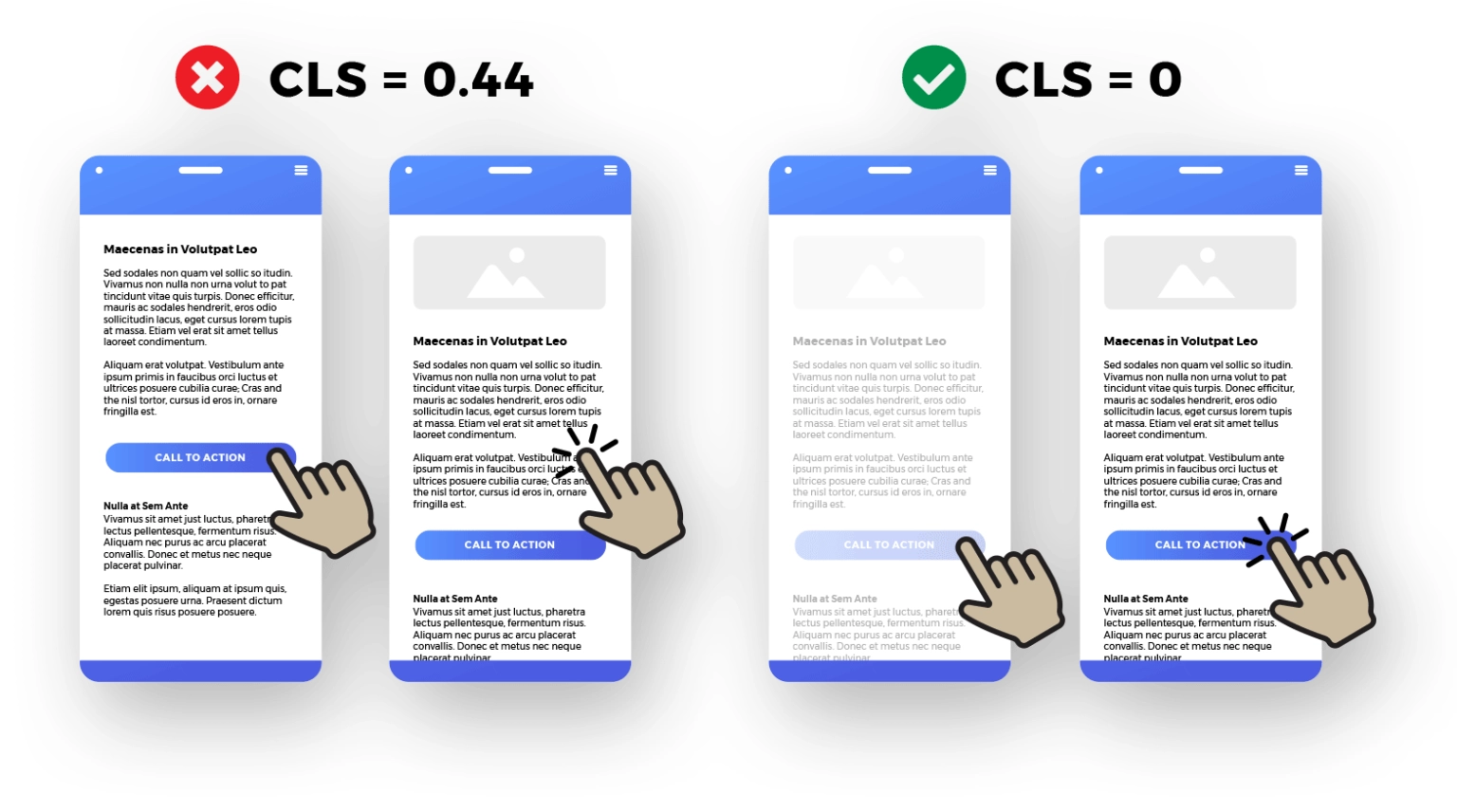
CLS is a Core Web Vital, which is among the key metrics search engines like Google use to analyze and rank a website. If your website loses its layout upon zooming in or zooming out, it’s a strong sign to thoroughly check your cumulative layout shift.
Is Cumulative Layout Shift Important?
Cumulative layout shift, indeed, is a crucial metric that is worth tracking when it boils down to web design. It being a ranking factor makes it crucial for website owners to pay attention to improving and optimizing it.
A good CLS score refines the user experience, giving your website visitors a pleasant browsing experience. Due to this, you are likely to invite more qualified traffic to your website and increase your potential to generate revenue. Giving your customers the ultimate browsing experience on your website.
A low CLS score will show up as a website loading with an erratic layout shift, eventually making it challenging for your visitors to find the information they are looking for. Cumulative layout shifts can be experienced on phones as well as desktop computer devices.
With websites becoming an important component of any business’s online presence, CLS can hamper the type of experience you want your customers to have when they are on your website.
What Causes a Cumulative Layout Shift Score To Change
Difficulties like cumulative layout shifts can become a challenge to manage as they directly affect how your customers see your website, along with how search engines like Google view your website.
If your website constantly has shifting layouts, it will become impossible for your visitors to read or understand the content present on your website. But what causes such a layout shift to pop up? There are many reasons for this, including issues with fonts and visual content on your website, and even problems with certain codes on the website can cause such problems.

At the same time, poor loading speed or too much dynamic content on a webpage can also cause layout shifts. This happens because the image tag didn’t properly fetch adequate height and width of the visual content.
While using animated elements and high-quality designs is guaranteed to increase your website’s charm, there’s always a risk of them not loading as expected if your website visitors have a slow internet connection. To avoid such instances, many website owners often prefer using CSS properties. Aside from this, opting for a fallback font ensures the fonts are visible and load quickly. These are also the reasons Google often recognizes layout shifts as the reason.
What Is an Ideal Cumulative Layout Shift Score
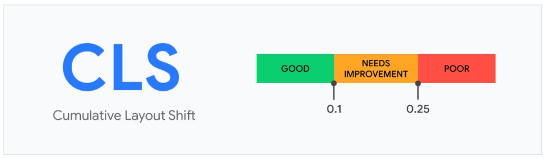
A poor cumulative layout shift will prevent your website visitors from making the most out of your website.
How To Measure Cumulative Layout Shift
The simplest way to calculate the layout shift score is a product of impact fraction and distance faction, often represented by the equation:
Layout Shift Score = Impact Fraction*Distance Fraction
Where,
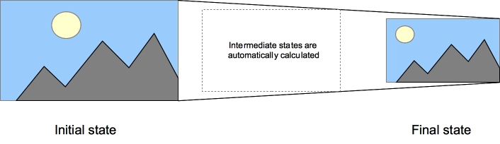
Impact fraction is the combination of visible areas of all the unstable elements on a webpage for a specific frame along with the previous frame. It is often a fraction of the total viewport area. When an element shifts (that is, changes its position), its previous and current positions make up the impact fraction.
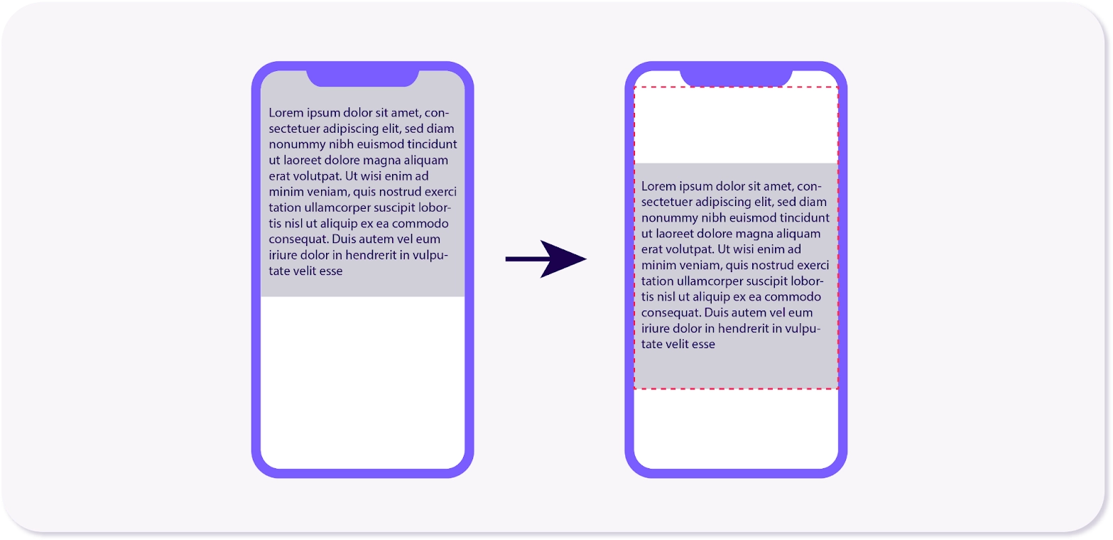
Let’s understand this with an example. Consider an image of 1000px, and the viewport is 2000px, meaning the image is likely to take 50% of the viewport. As the CSS loads, the dimension is likely to drop by 25% of the viewport, which is 500px.
As a result, the impact fraction will be calculated by adding both the viewport fraction sizes: 50 + 25 = 75. So, the impact fraction will be 0.75.
Distance fraction represents the distance an element has moved across the viewport from the horizontal and vertical distance. The resultant frame is divided by the viewpoint’s biggest dimension, be it the height or width. The greatest number of either is used for calculation.
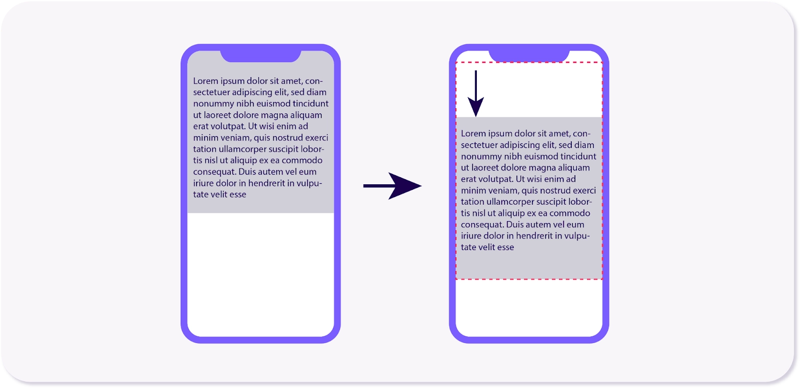
By following the same example (as used to explain impact fraction), if the image shifts by say 700px, which is 30% of the viewport size. Due to this, the CLS will be 0.75 x 0.30 = 0.225.
How To Improve Your Cumulative Layout Shift Score
Now that you know how cumulative layout shift is calculated, it is time to know how you can avoid it. These are some practical tips to try if your website is constantly showing cumulative layout shifts:
-
Clear the Image Dimensions
Responsive Web Design is becoming a norm today, especially because of the convenience it offers to the visitors. CSS has over the years taken up as the go-to solution for resizing images.
But this choice often causes image reflow issues, eventually causing the shift. To avoid this from happening, browsers now calculate aspect ratios by default on the image dimensions that are specified by the website in terms of width and height. It makes it easier for browsers to make a spot for images.
As a result, the images load perfectly, avoiding layout shifts and delivering an exceptional user experience. To ensure this is implemented right, make sure you are setting the width and height attributes on img tags and use CSS when resizing images as per the requirements.
-
Opt for CSS Transitions Instead of Animations
Animations can sometimes stress the website more than expected. It can lead to inconsistencies when the website loads and a cumulative layout shift occurs. CSS transitions, on the other hand, are smooth and open seamlessly without causing a layout shift.
CSS transitions make it possible to control the rate at which an animation will be shown when CSS properties are changed. In place of property changes that take place almost immediately, you can ensure the changes in the property take place gradually.
For instance, if you are planning to switch the colors of a website element from pink to green, the change can be done in an instant. With the CSS transitions, such changes can take place following the acceleration curve.
This parameter can be customized depending on your website’s speed. CSS transitions help decide which elements to animate by setting a delay, how long the animation will last by setting a duration, and how the transition will run by setting the easing function. If your website is still facing CLS issues, checking the type of CSS transitions can be helpful. Following are some commonly used CSS transitions.
- Property: The property specifies the name(s) of CSS properties on which the transitions need to be applied.
- Duration: It’s concerned with the duration for which the animation will be played.
- Timing function: It defines the intermediate values where the properties are shown.
- Delay: The time before the animation actually begins.
-
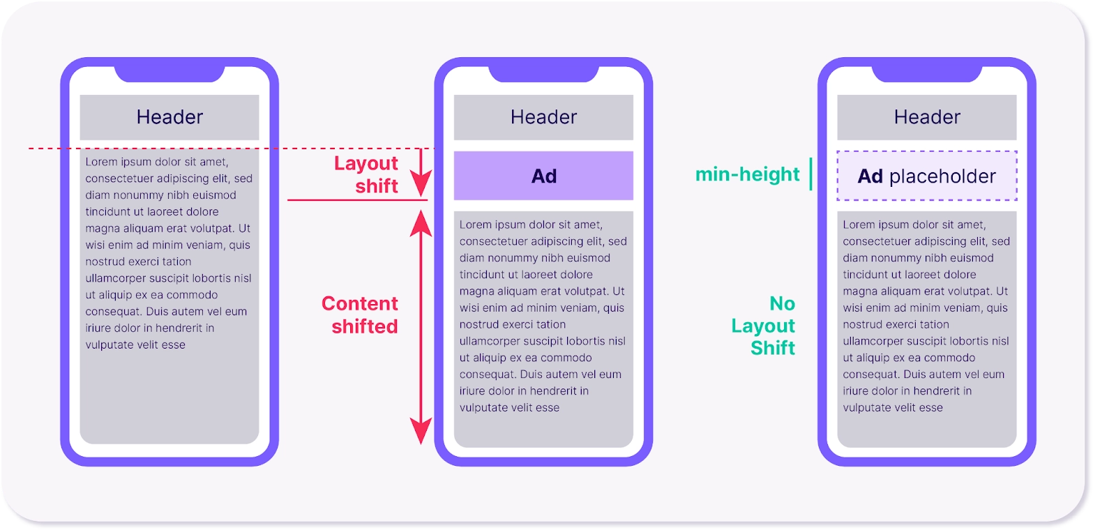
Reserve Space To Ensure Ad Layout Stability
Many believe that ad placement can negatively influence cumulative layout shifts. Due to this, it is crucial that your website has dedicated ad spaces to ensure when the website loads rapidly, there are no out-of-place shifts.
Such situations are tricky as they can jeopardize the revenue along with the user experience your website offers to its users. The good thing about ads is that you can have control over them, especially where they should be placed. There are many ways to achieve this.
- Place the late-loading dynamic content at a lower position on the webpage to avoid sudden shifts.
- Make use of ad placeholders with fixed dimensions to make it easier to render them when the page is loading. It can significantly reduce shifts.
- Setting ad attributes ensures the browser knows how much space to keep aside for ads when the page is loading.
- Strictly avoid collapsing the ad containers, even if it results in blank space.
- You can also consider adding a mini styling element or new aspect-ratio CSS property, making it possible for ad containers to grow as needed. It keeps the user experience in place while reducing the chances of layout shifts.
-
Preload Fonts
Hosting your fonts locally and preloading fonts can be immensely helpful in avoiding shifts. This works incredibly well because the browser caches, preventing slow loading speeds. Aside from this, when the fonts are preloaded, they load quickly, preventing text overflow. You can try these methods for a smoother and well-aligned font experience:
- Making use of link rel=preload to load critical web fonts at the earliest will prevent font shifts.
- Using font-display optional can be helpful as it will call the web font only when it is available by the initial layout time.
- Use size-adjust, ascent-override, descent-override, and line-gap-override APIs to make the fallback font easier to recall.
-
Make Use of Back/Forward Cache
The back/forward cache usually keeps a web page in the browser’s history for some time, even if the user has moved away from the page. Browsers are programmed to do this, so if you want to revisit the previous page, the loading is fast, and you won’t have to wait. This also prevents font repaints and, eventually, avoids the shifting of fonts.
While the feature is available on all browsers to improve browsing and user experience purposes, there can be times when certain complexities may make it challenging for the system to work. They can be:
- The website requires user authentication to deliver personalized content.
- There’s heavy stress on resources to give the website a lively look and navigational experience.
- There’s the presence of cache control headers that can process requests and responses for cache.
- The JavaScript interactions are complex, making it challenging for the browser to process and load the page quickly.
- Complex Cross-Origin Resource Sharing (CORS) makes data transfers between browsers and servers excessively time-consuming.
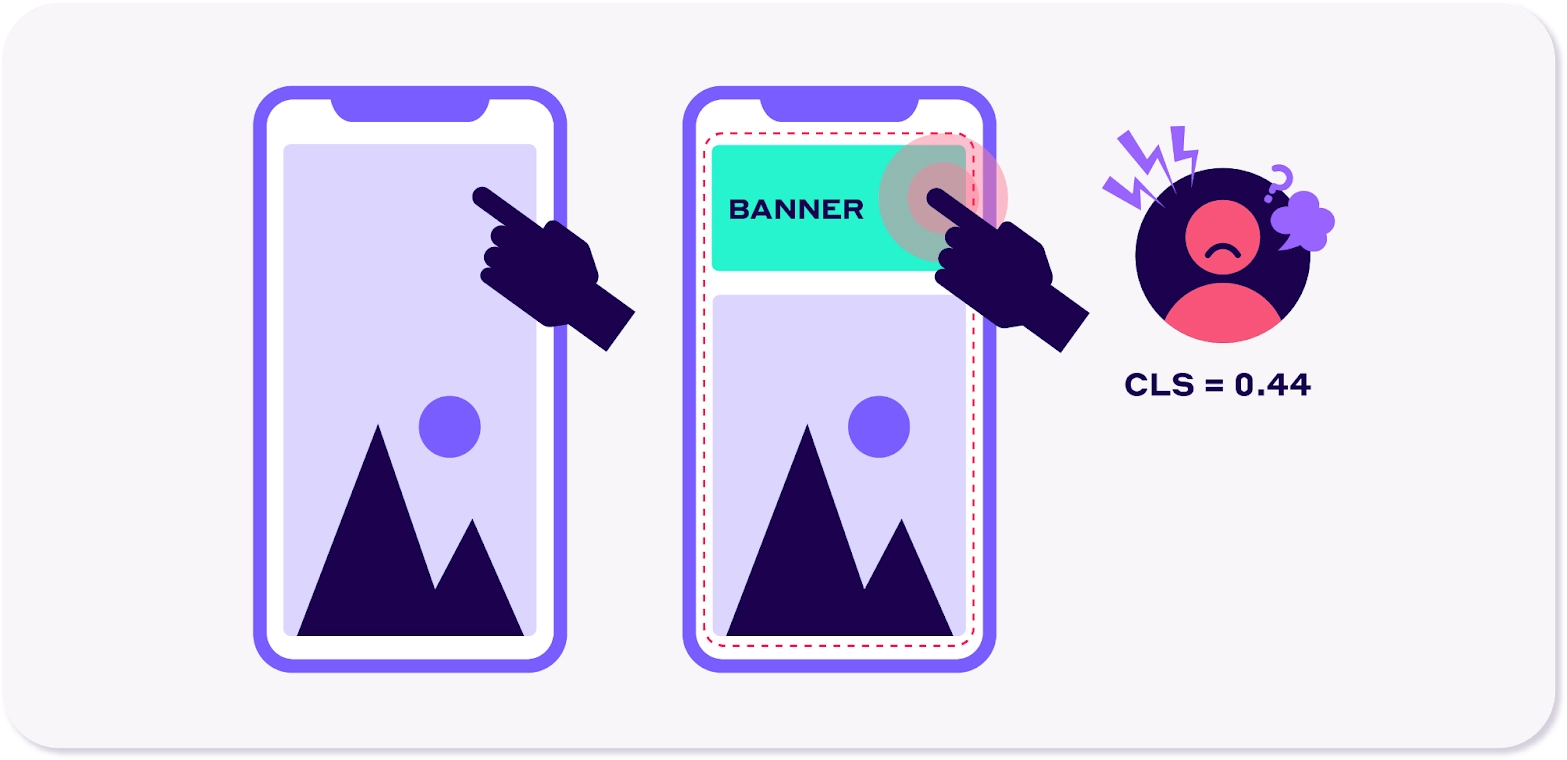
Differences Between an Unexpected and Expected Layout Shift
Identifying if the layout shift on your website is expected or unexpected is crucial to ensuring you can tackle the situation at the earliest possibility. When a visitor visiting your website opens the scroll-down menu and the page’s layout shifts, it is called an expected shift, as it happened due to the user interacting with the page.
On the other hand, when the page’s layout shifts without any user interaction, it is known as an unexpected shift. An unfixed CLS will make it nearly impossible for your website visitors to fully go through the website and find information that benefits them.
This, in return, will increase the bounce rate of your website, a factor that search engines like Google highly regard when ranking websites on SERP.
So, if your pages are constantly facing layout shifts, it can be hampering your website’s potential to rank highly. Another factor that these shifts damage is the user experience (another factor that search engines weigh when ranking a website). Make sure you are checking your website on different devices and browsers to fix any unexpected layout shifts.
Bottomline
The cumulative layout shift is like an unexpected ingredient in a beautiful recipe that can ruin the overall taste for your potential customers. To avoid losing out on website traffic and conversion possibilities, make sure you are fixing the layout shift issue by exploring different reasons that lead up to them. From establishing a preload font to giving more priority to CSS transitions, there are multiple ways you can make your website user-friendly, free from layout shifts, and easy to navigate.